You can spot the weddings that nailed the details from the first photo strip.
Not because the couple spent more – because everything feels intentionally theirs. The typography matches the invitations. The colours echo the florals. The vibe carries from the welcome sign to the dance floor. And when the photo booth print lands in a guest’s hand (or their camera roll five seconds later), it doesn’t look like a generic party souvenir. It looks like it belongs to the day.
That is the real power of custom photo booth templates for weddings. They are small, fast, and fun in the moment – but they also become one of the most shared pieces of your wedding aesthetic.
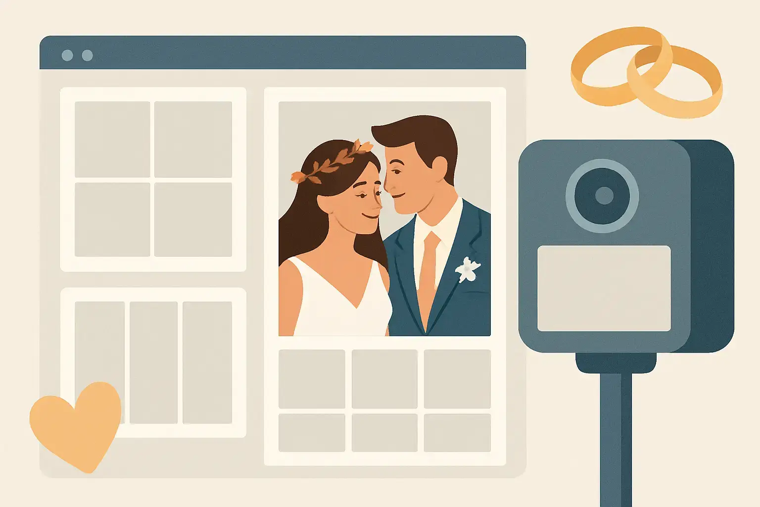
What a wedding photo booth template actually does
A template is the designed frame that wraps your guest photos or videos: the layout, fonts, colours, monograms, date, and any little design elements that signal your theme. It shows up on printed strips, 4×6 prints, and digital shares sent by text or email.
But functionally, it does more than “look pretty.” It anchors the booth experience to your wedding brand. Guests may not know what kerning is, but they know when something feels polished. A great template turns a quick photo into a keepsake, and it makes your booth content instantly recognizable when it hits Instagram stories the next morning.
Why custom photo booth templates matter more than most couples expect
Most couples think about templates last – after they’ve chosen the booth, the backdrop, and the big-ticket pieces. The catch is that the template is the part that leaves with every guest.
If you are doing prints, your template becomes a mini wedding favour that does not get left on a table. If you are doing digital sharing, it becomes a watermark for your memories as they travel through group chats and feeds. Either way, it is the most repeated design element of your reception night.
And here is the planning bonus: a cohesive template makes other decisions easier. When the template matches your stationery and signage, everything else looks more expensive, even if you kept your decor budget realistic.
Choosing a template style that fits your wedding (not just Pinterest)
The best template is not the one with the most design elements. It is the one that feels like your day.
If your wedding is classic and romantic – think vineyard, whites and greenery, candlelight – a clean layout with elegant serif typography and plenty of breathing room will age beautifully. If your wedding is modern Niagara chic with bold colours or a fashion-forward vibe, a strong monogram, high-contrast type, and graphic lines can feel intentional and editorial.
If you are leaning rustic, the temptation is to go heavy on burlap textures and scripted fonts. Sometimes that works. Sometimes it reads dated fast. A smarter move is to keep the layout modern and bring rustic in through subtle elements: warm neutrals, a light paper texture, or a botanical line drawing that matches your florals.
It depends on what you want the template to do. If the booth is a high-energy guest magnet, the template can be playful. If you want it to feel like a premium print you would actually frame, keep it minimal and timeless.
Layout decisions that change the whole experience
Design is not just aesthetics – it shapes behaviour.
A classic photo strip layout encourages guests to do multiple poses, which is perfect for groups and that “one serious, one silly” rhythm people love. A 4×6 layout feels more like a portrait and tends to produce more frame-worthy photos, especially for couples and family shots.
There is also the question of how much branding you want. Some couples want the name and date bold and centre. Others prefer a quiet signature in the corner so the photo stays the star. If you are planning a lot of social sharing, a slightly more visible name and date can be worth it – it helps your memories stay tied to your story when photos get reposted.
One more trade-off: adding too much text (hashtags, venue name, long quotes) can crowd the image and make the print feel busy. If you love a quote, keep it short and place it where it will not compete with faces.
Matching your template to the booth format
This is where customization gets really fun, because different booth experiences create different kinds of content.
A Magic Mirror-style experience feels interactive and a little glamorous, so templates that mimic high-end editorial layouts, clean borders, and modern monograms tend to land beautifully. Guests already feel like they are stepping into something special – the design should meet that energy.
A Retro Photo Booth vibe leans nostalgic and effortless. Photo strips, subtle film borders, and a hint of vintage typography can make the output feel intentionally throwback without looking like a filter from 2012.
And if you are adding a 360 video booth, your “template” is less about a print frame and more about an overlay – the graphic that sits on the video while your guests have their main-character moment. With 360 content, legibility matters even more. Thin fonts and pale colours can disappear once movement and venue lighting enter the picture. Bold, clean type and high contrast are your best friends.
Colours, fonts, and the details guests actually notice
If you want your template to match your wedding, start with the elements you already chose: invitation suite, day-of signage, and your palette.
A great rule is to pick one primary font that mirrors your stationery style, then pair it with a simple supporting font. Two fonts is usually plenty. Three can work, but only if one is very subtle.
For colours, match undertones, not just names. “Blush” can be warm or cool. “Sage” can lean grey or olive. Your template should look right next to your florals and bridesmaid dresses, not just on a screen.
Then add one signature detail that feels personal. A monogram, a small line drawing of your venue, a motif pulled from your invitation liner, or even a tiny nod to Niagara – grapes, a waterfall-inspired line, or a skyline silhouette if it fits your story. The key is restraint. One meaningful detail reads elevated. Five reads like clip art.
How to make templates photo-friendly in real reception lighting
Reception lighting can be gorgeous and still be tricky: warm uplighting, dark corners, DJ lights, and candlelight all affect how designs show up.
If you are printing, avoid very thin lines and very pale colours. They can disappear on paper, especially with warm tones. If you are going digital-only, you have a bit more flexibility, but keep in mind that guests will view photos on bright phones and dim phones, in night mode, and sometimes as tiny previews in messages.
Also, leave space around faces. It sounds obvious, but some templates put decorative elements too close to where people stand, and suddenly the best part of the photo – the smile – feels cramped. A strong template frames the moment without fighting it.
What to prepare before you request a custom design
Couples get the best results when they come in with a clear starting point, not a fully formed graphic design brief.
Have your names as you want them displayed (full names, first names only, initials, or a shared last name if you are changing it). Have your wedding date in your preferred format (2026-06-14 vs June 14, 2026). Have two to three reference images that show the vibe you love, plus one example of what you do not want.
If you have a monogram from your stationery designer, share the file if possible. If you have a colour palette, share the exact shades or a photo of your invitations in natural light. Screens lie. Paper tells the truth.
And if you are working with a planner, loop them in early. They will know what needs to match for the whole day to feel cohesive.
The most common mistakes (and how to avoid them)
The biggest mistake is treating the template like an afterthought. When it is rushed, it looks rushed.
Second is trying to make the template carry the whole theme. Your template does not need to explain that your wedding is “romantic garden party meets modern minimal.” It just needs to feel like it belongs.
Third is designing for you only, not for guests. Your guests want to look good. If the template is too busy, too dark, or too trendy, the photos will not get displayed on fridges and desks – they will get tucked away.
And finally, watch for proofing errors. One wrong date can haunt you forever. Always proof the spelling, the date, and the order of names. Then proof it again the next day with fresh eyes.
Getting the full experience: template + backdrop + sharing
Templates shine brightest when they are part of a complete look. Backdrop textures, lighting, and booth placement all affect the final result. A dreamy template paired with a wrinkled backdrop or a cramped corner will never hit as hard as it should.
This is where a photography-first team makes a difference, because the goal is not only a cute frame – it is a flattering, high-impact image inside the frame. If you are building your wedding entertainment around polished visuals, it helps to work with a provider who cares about the final output as much as the fun of the moment.
If you want custom photo booth templates for weddings that feel like they were designed for your exact vibe – and you want the booth experience to look as good as it feels – the team at Pic Booth can guide you through layout, styling, and the right booth format for your guest list.
Your template is the tiny detail that shows up everywhere: in hands, on phones, in albums, and in the little memory boxes your friends keep for years. Give it the same intention you gave your vows, and it will keep telling your story long after the last song.