The moment your guest grabs their print is the moment your photo booth goes from “fun activity” to “favourite keepsake.” It is also the moment your design choices get judged – in the nicest way. If the print looks like it belongs at your wedding, it gets tucked into clutches, pinned to fridges, and slipped into scrapbooks. If it feels generic, it gets left on a table by the guest book.
If you are wondering how to customize photo booth prints so they feel intentional, elevated, and totally you, think of the print like a mini piece of your stationery suite. It should echo the vibe of the day, photograph beautifully, and still be readable under reception lighting when your guests are mid-laugh.
Start with the one job your print needs to do
Before you pick fonts or frames, decide what you want the print to be.
Some couples want a true keepsake – a gorgeous little photo that matches their invitations and looks at home on a fridge. Other hosts want a playful souvenir – bold, cheeky, maybe themed to the point of being a little extra (in the best way). Corporate events often want brand-forward prints that do quiet marketing without feeling like an ad.
That goal changes everything. A keepsake print usually means cleaner layouts, fewer graphics, and more breathing room. A playful souvenir can handle heavier colour, bigger titles, and more illustrated elements. Brand-forward prints need clarity and consistency first, then personality.
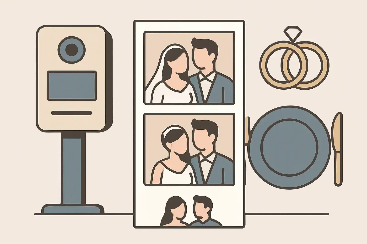
Choose a print format that flatters real people
Layout is not just design – it is how faces and outfits are framed.
Classic photo strips are popular for a reason: they feel nostalgic, they fit into wallets, and they encourage guests to do three different poses without overthinking it. But strips can be tricky if your backdrop is wide, your group shots are big, or your guests are dressed up and want a more “portrait” look.
A 4×6 print feels more like a professional photo. It gives you space for a larger image plus a tasteful border, names, and date without shrinking the actual photo. If you want your prints to look like part of your wedding photography story, 4×6 is often the easiest path.
You can also mix the vibe by using a strip-style collage on a 4×6. It keeps the playful energy while giving more room for design.
The trade-off is simple: the more images you cram into one print, the smaller each image becomes. If your guest list loves group shots, fewer frames with bigger faces usually wins.
Match your wedding look without copying it too literally
The best customization does not scream “theme.” It whispers “this belongs here.”
Start by pulling two or three design cues from your day: your main colour, one accent, and a style direction (modern, romantic, vintage, minimalist, garden-party, black-tie). Then let the print be a supporting character.
If your wedding has soft florals and airy neutrals, a print with a clean white border and a small floral corner detail will feel natural. If your vibe is modern and bold, a full-bleed image with a sharp type treatment and a rich solid bar can look incredible.
Be careful with exact colour matching. Reception lighting, printers, and photo booth flash can all shift tones a bit. If “sage” is sacred to you, use it as an accent rather than a full background colour. You will still get the harmony without risking a slightly-off green that bugs you forever.
Design around readability in real reception conditions
A photo booth print gets seen in low light, sometimes with a drink in hand, sometimes while people are dancing. That means readability matters more than you think.
Thin script fonts can look gorgeous on a mood board and then vanish on a physical print. If you love a script, keep it for names or a short phrase, then pair it with a clean sans-serif for the date and location.
Also watch contrast. Light grey text on a white background is elegant, but it can disappear. If you want subtlety, use a darker neutral and rely on spacing to keep it refined.
A good rule: if someone can read it from arm’s length while walking away from the booth, you nailed it.
Pick the right amount of information (less is usually more)
When couples ask how to customize photo booth prints, they often start by trying to fit everything: full names, date, venue, city, hashtag, a quote, a monogram, and maybe a tiny map for fun.
You can, but it depends on what you want the print to feel like.
If you want it to feel like a premium photo, keep the text minimal. First names + date is often enough. If you want it to feel like a wedding souvenir, add the venue or location. If you want it to drive sharing, include a short hashtag or handle.
The biggest mistake is adding text that competes with the photo. The photo is the hero. The words are the signature.
Use your border like a frame, not a billboard
A border can elevate a print instantly, but only if it is proportioned well.
Thin borders feel modern and gallery-like. Thicker borders feel more “polaroid” and can be very romantic, especially with a handwritten-style note or small emblem in the bottom space.
Full graphic frames can be fun for themed events, but they reduce the visible photo area. If you go heavy on the frame, make sure the layout still leaves enough room for faces, especially if you expect group shots.
If your guests are dressed to the nines, consider giving the photo more real estate. Let the outfits and expressions be the design.
Bring in a monogram or crest the smart way
Custom monograms and crests look incredible on prints – when they are used with restraint.
A small crest in one corner or centred at the bottom can make the print feel like it came from your stationery designer. A giant monogram over the photo can feel like a watermark, which is not the energy you want for your guests.
If you already have a monogram from your invites, you are in great shape. If not, you can still create a simple initials lockup using your print fonts. The goal is cohesion, not complexity.
Consider a “second side” concept, even on one-sided prints
Most photo booth prints are one-sided, but you can still design with the idea of a front and “back” in mind.
The front is your clean, pretty photo-forward design. The “back” is what you save for the gallery: the extra branding, the event title, or anything you want captured digitally when guests share.
This matters because many booths deliver images by text or email, and that digital file becomes the version that gets posted. If your print layout includes a tasteful tag or short phrase, it rides along in every share.
Think about finish and paper feel (yes, it changes the vibe)
Customization is not just what you see – it is what you hold.
Glossy can make colours pop and feel classic-photo-lab. It is vibrant, and it can look amazing under good lighting. Matte feels more editorial and modern, and it tends to photograph well if guests are taking pictures of their prints.
The trade-off is that glossy can show fingerprints more easily, and matte can slightly soften contrast. Neither is “better.” It depends on whether you want high-shine energy or a more refined, tactile look.
If you are planning a black-tie wedding, a clean layout on a matte finish can feel very premium. For a lively party vibe, glossy can match the sparkle.
Customize for the booth style you are booking
Different booth experiences create different kinds of images, and your print should match.
A Magic Mirror moment often feels glamorous and interactive, so the print can handle a bit more romance: soft borders, a monogram, maybe a short line like “A night to remember.”
A Retro Photo Booth look leans nostalgic, which pairs beautifully with classic strips, a simple date stamp, or subtle film-inspired elements.
If you are also doing 360 video, your print can act as the “still” counterpart – a clean, photo-forward design that balances the high-energy digital content your guests will share.
This is where a consult helps. When your booth company is photography-first, they will think about lighting, framing, and output together, not as separate decisions. If you are in Niagara and you want that kind of guided customization, Pic Booth offers consultation-led rentals that treat your print design like part of the overall experience: https://picbooth.ca
Build in one personal detail your guests will actually notice
Personalization hits hardest when it is specific.
Instead of adding more graphics, consider one meaningful touch: your handwritten signature scanned in, the coordinates of your ceremony spot, a tiny illustration of your venue outline, or a one-line lyric that is truly “your song.”
The key is to keep it short enough that people read it, smile, and move on to the next pose. If your customization makes guests pause too long to decode it, it slows the line and steals momentum.
Proof your design the way your guests will experience it
Before you finalize anything, test it.
Look at it on your phone and imagine it as the file your guests will text to themselves. Then picture it printed and held at arm’s length. If possible, print a sample on any home printer just to check text size and spacing. It will not match the final quality, but it will immediately show you if your names are too small or your border is too thick.
Also consider how it will look next to your wedding palette in real life. If your decor is warm candlelight and champagne tones, a bright white border can still work, but you may prefer a softer off-white look so it feels intentional.
The most common customization mistakes (and easy fixes)
The biggest issue is overdesigning. Too many fonts, too many colours, and too many clip-art style elements can make the print feel busy, which takes away from the photo.
Another common problem is placing text where faces end up. If your layout has a big title at the top and your guests naturally stand high in frame, you get awkward cropping. A small bottom band or a clean border area is usually safer.
Finally, do not forget consistency. If you are doing multiple booth experiences or multiple print sizes, keep the same core design language so everything feels like one story.
A gorgeous photo booth print is not about doing the most. It is about making one tiny piece of paper feel like it could only have come from your day – and giving your guests something they will want to keep long after the last song plays.