The moment your guests walk into the room, they do a quick scan: where’s the bar, where’s their table – and what’s the one thing they need to take a photo with.
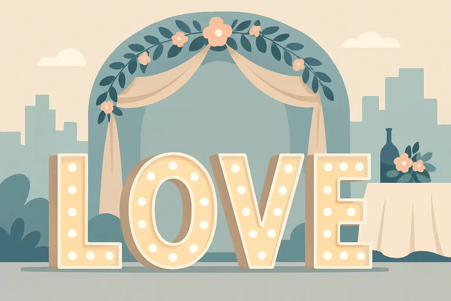
LOVE marquee letters are that thing.
A love marquee letters rental for wedding celebrations isn’t just decor. It’s a built-in gathering point, a lighting moment, and a subtle way to make your reception feel like an event, not just a dinner. But like any statement piece, it works best when it’s placed with intention, styled to match the space, and paired with the right kind of photo experience.
Why LOVE marquee letters work so well at weddings
There’s a reason you keep seeing marquee letters in real wedding galleries. They hit three goals at once: they set the mood, they guide guest flow, and they create a photo backdrop without asking anyone to “pose.”
First, they add instant atmosphere. Warm bulb light reads romantic on camera and in real life – especially in Niagara venues where you’ll often have candlelight, twinkle lights, and golden-hour vibes in play.
Second, they give people a place to go. During cocktail hour, between courses, or when the dance floor needs a minute to warm up, guests like having a “moment” to do. LOVE letters create a natural loop: guests spot them, gather, take photos, and move on.
Third, they photograph beautifully across styles. Whether your wedding is vineyard-chic, modern black-tie, or airy and minimalist, the letters feel classic rather than trendy when they’re sized properly and not fighting the rest of the decor.
Where to place LOVE marquee letters for the best photos
Placement is everything. The same letters can look iconic in one corner and awkward in another, and it usually comes down to lighting, sightlines, and foot traffic.
Behind the head table or sweetheart table
This is the “grand statement” placement, and it’s popular for a reason. The letters frame you during speeches and give your photographer a clean, glowing focal point. It also ensures the letters are in the background of lots of candid moments.
The trade-off: if your head table backdrop already includes draping, florals, neon, or a feature wall, it can get busy fast. In that case, the letters can either compete or get visually lost.
Near the dance floor
This placement keeps energy up. The letters become part of the party and show up in dance photos, which is exactly where you want that warm light. It also keeps guests circulating in the space.
The trade-off: dance floors are high-traffic, and you don’t want guests tripping over cords or crowding a tight corner. If your venue layout is compact, you may want the letters slightly off to the side rather than right at the edge.
At the entrance or welcome area
LOVE letters at the entry set the tone instantly and give guests something to do while they wait for the room to open or for the bar line to move. This is especially helpful if you have a bit of a lull between ceremony and reception.
The trade-off: entrances can be tight, and if the lighting near the door is harsh or dim, photos can suffer. You’ll want a spot that’s open enough for small groups to gather without creating a bottleneck.
Beside the photo booth
If you want maximum guest participation, this is the power move. The letters act like a beacon that pulls people toward the booth area, and they make your booth setup look more styled and intentional.
The trade-off: the booth backdrop still needs to read clearly. The letters should complement the booth zone, not steal the whole scene.
Styling tips so the letters match your wedding aesthetic
Marquee letters are bold by nature, so the goal isn’t to “dress them up” until they disappear. The goal is to make them look like they belong.
Start by thinking about colour temperature. Warm bulbs flatter skin tones and feel romantic, but they’ll look different depending on your venue lighting. If your reception space leans cool (lots of white uplighting, blue tones, modern finishes), consider warming the area with candles, soft florals, or warmer uplights so the letters don’t feel like a separate world.
Florals can be beautiful near the base of the letters, but less is often more. A few grounded arrangements or greenery clusters can soften the look without blocking the bulbs. If your florals are already doing a lot elsewhere, let the letters be clean and graphic.
Also, protect negative space. LOVE letters look best when you can step back and see the full word. If they’re squeezed between a pillar and a wall, you lose the impact. Give them breathing room so photos capture the whole moment.
Making LOVE letters more than “just a backdrop”
The couples who get the most value from a love marquee letters rental for wedding day are the ones who treat it as an experience zone, not a static decor item.
Here are a few ways it turns into a memory-maker.
If you’re doing a first look, you can use the letters as a soft-lit meeting point later for a quick “just us” photo after the rush of dinner. If you’re doing table visits, plan a 5-minute window to step over and snap a few fun shots with your wedding party. It sounds small, but those end up being the photos you share first.
If you want guest interaction, the letters can anchor a mini “photo moment” even for guests who don’t love the dance floor. People who aren’t big on dancing will still happily gather for a group photo with something iconic behind them.
And if you’re pairing the letters with a booth, you can create two distinct options in the same area: classic posed photos at the booth, plus casual smartphone shots and candid group photos around the letters. That variety is what makes a reception feel full of moments.
Pairing LOVE marquee letters with photo experiences
This is where your wedding starts to feel like it has layers. The letters set the scene, but the capture method changes the vibe.
A Magic Mirror-style setup pairs beautifully because it feels elegant and interactive – guests are already dressed up, they’re feeling themselves, and the letters nearby give the whole area a “main character” glow.
A Retro Photo Booth leans into nostalgia and timeless print keepsakes. With LOVE letters nearby, you get that perfect mix of modern statement decor and classic photo-strip energy.
A 360 video booth turns the letters into motion and sparkle. The warm bulbs read incredibly well in video, and the letters give guests something to play to – it’s an instant “step in, pose, spin, laugh” moment.
If you’re building a full guest journey, you can add something screen-free as a counterbalance. A digital disposable-style camera option gives you candid snapshots from your guests’ point of view, while the letters and booth handle the polished, shareable content.
If you want help matching the right booth format and add-ons to your venue and vibe, a team like Pic Booth approaches it as a guided, photography-first plan – which matters when you care about how everything looks in the final gallery, not just how it looks in the room.
Practical planning details couples forget to ask
LOVE letters feel simple, but there are a few practical questions that save you stress.
First: size and scale. You want letters that read across the room, not just up close. Oversized letters look luxe; too-small letters can feel like an afterthought. Your venue ceiling height and the distance from key photo angles should guide the choice.
Second: power and placement logistics. Ask where power will come from and how cords will be managed. A clean setup protects guests in heels, keeps the look polished, and makes your photographer’s job easier.
Third: timing. If you’re flipping a room between ceremony and reception, confirm whether the letters will be installed before guests enter and whether they can be moved if your timeline changes. Full-service delivery and setup is one of those behind-the-scenes details that makes the whole day feel calmer.
Fourth: photography considerations. The bulbs are bright points of light, which can look dreamy or distracting depending on exposure. A photographer who understands lighting can make them look stunning, and a good booth setup will balance the letters so both faces and bulbs photograph well.
When LOVE letters might not be the right choice
Sometimes the most premium decision is saying no.
If your venue already has a showstopper focal point – like a dramatic fireplace wall, a built-in neon sign, or a floor-to-ceiling window view – adding LOVE letters can split attention. In that case, you might be better off placing them in a secondary space, like the cocktail area, rather than competing with the main feature.
If your reception footprint is tight, the letters can create crowding in key pathways. You can still get the impact by choosing a different photo moment (like a patterned backdrop with a booth) and letting the room breathe.
And if your aesthetic is ultra-minimal and you want the room to feel quiet and editorial, marquee bulbs may feel too playful. That doesn’t mean you can’t do them – it just means you’ll want to keep surrounding decor clean and avoid piling on extra signage.
Budget value: what you’re really paying for
LOVE letters look simple, but what you’re paying for isn’t just the physical letters. You’re paying for the effect they create all night and the photos they show up in for years.
If you’re choosing between several decor upgrades, ask yourself what will be noticed, used, and photographed. Guests don’t interact with every design detail, but they absolutely interact with a glowing statement piece that invites them in.
The smartest approach is often bundling: treat LOVE letters as the anchor, then build one additional interactive element around it (a booth, an audio guest book, or both). That’s when the investment starts returning memories, not just ambiance.
A helpful way to decide is this: if you want your reception to feel lively even during the in-between moments, LOVE letters deliver. If your night is already packed with programmed entertainment and your space is visually full, they may be optional.
If you picture your guests walking in, spotting the glow, and instantly saying, “Okay, we need a photo there,” you already have your answer – plan the placement, keep the styling intentional, and let the letters do what they do best: pull people closer, one photo at a time.