
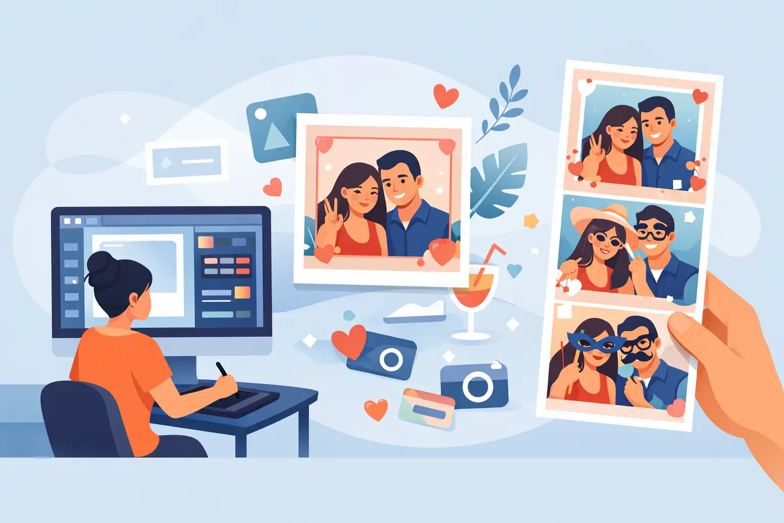
A great photo booth image should still make sense years from now. Your guests’ faces, the energy of the dance floor, and the little details of your celebration deserve more than a generic border with two names dropped into it. Learning how to design photo booth overlay artwork is about creating a polished keepsake that feels connected to the room, the moment, and the people in it.
For weddings, the overlay often becomes one of the most-taken-home details of the night. For corporate events, it can turn every print and digital share into a branded moment without making the photo feel like an advertisement. The best designs are memorable because they know when to stand out and when to let the people in the frame do the talking.
Start With the Photo Booth Experience
Before choosing fonts, florals, or colours, decide what your guests will actually receive. An overlay for a DSLR photo booth print has a different job than an overlay for a Magic Mirror, a 360 Video Booth, or a Mosaic Photo Wall.
A classic print layout needs room for the photo, event details, and possibly multiple images. A Magic Mirror experience may call for a more elegant, spacious frame that complements full-length portraits. With 360 video, the design needs to work as a digital graphic layer, often sitting at the beginning or end of a shareable clip. It should be bold enough to register on a phone screen without covering the action.
This is why the photo booth format should shape the design from the first conversation. A beautiful overlay that is too busy for the print size, or too delicate for a fast-moving 360 video, will not deliver the impact you imagined.
How to Design Photo Booth Overlay Artwork Around Your Theme
Think of your overlay as part of your event stationery and décor family. It does not need to duplicate every detail from your invitation suite, but it should feel like it belongs in the same celebration.
Start with two or three visual cues already present at the event. That might be a soft champagne-and-black palette, the line art from a custom invitation, a citrus motif for a summer reception, or the rich green of your corporate brand. Choosing a focused direction keeps the design elevated. Trying to fit every wedding colour, floral variety, and decorative idea into a narrow print frame usually creates visual clutter.
For a romantic wedding, a refined script paired with a clean serif font can feel timeless. For a modern Niagara winery wedding, consider organic shapes, understated botanical elements, or a warm neutral palette. For a gala or company celebration, use a logo, brand colours, and a confident typeface, then leave enough breathing room for the photo to remain the hero.
The goal is cohesion, not repetition. Guests should recognize the event’s personality in the final image without feeling as though they are posing inside a poster.
Choose a Layout Before Decorating It
The layout determines whether the overlay works in real life. Begin by mapping the photo area first, then reserve a clear zone for names, dates, a hashtag, or event branding. Decorative elements come last.
For a standard print, a bottom banner or a simple border often works beautifully because it protects the photo area. A corner treatment can be especially effective when you want a light, editorial look. Full-frame florals, confetti, and heavy graphics can be gorgeous, but only if they do not compete with faces, hands, outfits, or a dramatic backdrop.
Ask yourself one practical question: where will guests naturally stand? If the booth captures full-body images, avoid placing important text low enough to be hidden by dresses, hands, or props. If it is a tighter portrait crop, keep text and logos outside the most likely face area.
Make Text Easy to Read at a Glance
Guests should be able to read the key details in less than a second. That is especially true for names and dates, which turn a fun photo into a meaningful keepsake.
Use no more than two font families in most designs. A decorative script can bring romance and personality, but it needs a highly readable companion font for details such as the date or venue. If guests have to squint at the print, the design is working too hard.
Contrast matters as much as font choice. White lettering over a pale floral background may look lovely on a screen but disappear when printed. Dark text on a light panel, or light text on a rich solid colour, tends to reproduce more reliably. If you are using metallic-inspired tones such as gold or rose gold, remember that printed ink may not have the same shine as foil. The colour can still feel luxurious, but the contrast must do the work.
For corporate overlays, keep the logo clear but restrained. A logo placed in a corner or along the lower edge can create strong brand recall while still allowing guests to feel like the centre of the image.
Design for Print and Digital Sharing
A photo booth overlay is rarely seen in only one place. Guests may hold a print at the reception, save a copy to their camera roll, text it to friends, or post it before the night is over. Your design needs to photograph well in all those moments.
Small details can get lost on a phone screen. Very thin lines, tiny text, and intricate patterns may look refined at full size but become muddy when shared digitally. Keep essential copy larger than you think, simplify decorative details, and test the overlay at the size guests are most likely to see.
Print quality also affects colour. Bright neon shades may shift, while pale blushes and dusty blues can look flatter than expected depending on lighting and output. A dedicated photo booth team can guide you toward colours and artwork that remain beautiful once printed, not just in a design preview.
If instant prints are part of the experience, consider the emotional value of the layout. Guests often tuck them into purses, pin them to fridges, or add them to guest books. A clear date and names make that little print feel personal long after the last song.
Let the Backdrop and Overlay Work Together
The overlay is only one layer of the final photo. The backdrop, booth lighting, guest attire, and venue colour palette all appear in the image too.
If your backdrop is already bold, such as a shimmer wall, lush floral installation, or colourful branded set, a minimal overlay will usually produce the stronger result. A clean border and a small line of text can give a busy image balance. On the other hand, a simple white, black, or neutral backdrop gives you more freedom to use expressive artwork around the photo.
This is also where professional photography-first planning makes a difference. The prettiest frame in the world cannot rescue poor lighting or an awkward crop. At Pic Booth, custom designs are considered alongside the booth style and event setting so the finished images feel intentional from edge to edge.
Add Personality Without Overloading the Design
The most shareable overlays usually include one personal touch guests immediately associate with the event. For a couple, that could be an illustrated venue silhouette, a meaningful phrase, a custom monogram, or a tiny nod to how they met. For a milestone birthday, it might be a playful phrase that suits the guest of honour. For a company event, it could be a campaign line or a visual element from the brand identity.
The trade-off is restraint. A custom illustration may be more meaningful than a page full of icons. A single well-chosen phrase can land better than several jokes competing for attention. Give the personal detail enough space to be noticed.
If you are creating a design for a Mosaic Photo Wall, keep the overall artwork especially clean. Individual images become part of a larger reveal, so consistent frames and a clear visual system help the final installation look polished. For a Draw Bot activation, the design direction can lean more playful and graphic, while still matching the wider event identity.
Review It Like a Guest Would
Before approving the final overlay, look at it on a phone and at print size. Check that names are spelled correctly, the date is right, and every important line remains readable. Then ask whether the design still works with a range of guest clothing colours and poses.
A few final checks can prevent the most common issues:
- Keep text away from likely face and body areas.
- Make sure logos and names have enough contrast.
- Use high-resolution artwork rather than screenshots or stretched images.
- Confirm that decorative elements do not crowd the photo.
- Review the design alongside the selected backdrop and booth format.
A thoughtful overlay does more than label a photo. It gives guests a little piece of the celebration to take home, share instantly, and smile about later. Choose details that feel true to your event, leave room for real moments, and let the people in front of the camera make the design come alive.